
Design systems are the DNA of great user experiences, weaving consistency and creativity into every interface.
A Project Showcase
In my professional journey, I have come to understand that showcasing a single, profound achievement can be more impactful than a plethora of outdated case studies. This is why I have chosen to highlight my design system as the cornerstone of my portfolio. This isn't just any project; it represents my most significant accomplishment to date.
A testament to my ability to create cohesive, user-centered frameworks that stand the test of time. While other case studies may have faded into obscurity, my design system remains a shining example of my dedication to innovation and excellence. By focusing on this key achievement, I aim to present a clear and compelling narrative of my capabilities and contributions in the field of design.
To comply with my non-disclosure agreement, I have omitted and obfuscated confidential information in this case study.
Privy
Privy is a digital identity and electronic signature solution provider based in Indonesia. It offers services that allow individuals and businesses to create and use verified digital identities and electronic signatures. Privy enables users to sign documents digitally in a secure and legally binding manner. The platform is designed to streamline administrative processes and support digital transactions.
Persona Design System
Introducing "Persona" – a comprehensive design system built from scratch over three years. This project showcases how strategic design principles can create a cohesive and scalable framework without a dedicated team.
"Persona" brings numerous benefits, such as maintaining consistency across platforms, streamlining workflows, and enhancing collaboration among designers and developers. Its reusable components not only save time but also ensure a unified visual language that strengthens brand integrity.
Engineers are particularly enthusiastic about "Persona" due to its practicality and efficiency. The design system simplifies their tasks, reduces redundancies, and fosters innovation. By providing a solid foundation, "Persona" allows engineers to focus on building exceptional user experiences.
The Untold Story Behind Privy's Design Transformation
My fifth year at Privy, in early 2022 was eye-opening. As a designer working on their digital identity products, I found myself drowning in an ocean of inconsistency. Each day brought new challenges that shouldn't have been challenges at all: spending hours hunting through hundreds of Figma files to find that one component I knew I'd designed before, watching developers struggle to implement different versions of the same element, and repeatedly answering questions about which shade of brand color was "the right one."
The breaking point came during my fifth year. I was working simultaneously on three different projects: a new product targeting international markets, a new feature for our internal management product, and a new feature for our enterprise product.
The pains I was facing
What was meant to be a direct design job ended up being a drawn-out hassle. I kept ending up: Generating identical elements over different documents, Keeping various incarnations of comparable items, Overwhelmed by infinite queries about colour schemes, distances, and typefaces, Struggling with uneven commentary on visual designs, Observing developers re-constructing parts that were previously located elsewhere
And then..
The revelation struck me during yet another late evening, revising a button design for the umpteenth time: this wasn't merely unproductive—it was unviable. Our business was rapidly scaling, our offerings were proliferating, yet our design methodology was our stumbling block. We required a framework. I comprehend that the awareness took an extended period to dawn.

The Initial State: A Fragmented Design Landscape
When I started to delve in-depth into our line-up, what I discovered resembled disorganization. Each item seemed like the work of an entirely distinct firm. Multiple styles decorated the buttons of our premium product alone. The lack of uniformity in the brand was even more startling: we had in excess of four different interpretations of our “brand colors” dispersed among different products. The “Color Brand” one team referred to varied vastly from another team's rendition. Our interfaces’ basic components were just as disjointed. Some input fields had rounded edges, others had acute ones; some labels drifted while others remained in place.
The further I investigated, the more dire it seemed. The spacing amongst elements lacked any sensibility, with hundreds of unique values creating a visual cadence that was closer to disorder than coherence. Modals, tables, and cards – components expected to ensure a consistent user interaction – existed in many varying forms. Even navigation, integral to user orientation, exhibited different schemes across our range of products.

The Silent Beginning
I started small, and I started quiet. Not because I feared rejection, but because I knew that showing would be more powerful than telling. During regular design tasks, I began building my own systematic approach:
Similar pattern app and competitor analysis
Collecting components used in all products and categorizing them
Created a personal component library for my own use and tested it
Documented every inconsistency I encountered
Tracked time spent on redundant work
Saved every question from developers about design specifications
Noted every instance of user confusion about interface behavior
The Implementation Process
Phase 1: Foundation Building (1 year 2 months)
Design Language Definition
Visual Audit (7 months):
Analyzed UI elements and variatons
Documented color variations
Mapped typography uses
Categorized spacing instances
Pattern Recognition (3 months):
Identified common patterns
Mapped interaction flows
Documented error states
System Architecture (4 months):
Created foundational tokens
Defined core principles
Established key guidelines
Developed base patterns
Phase 2: Component Development (6 months)
Component Library Growth
Month 1-2: Created primitive components and variants
Month 3-4: Expanded compound components and variables
Month 5-6: Baked complex components, localizations and theme mode
The basic mode theme is designed to simplify the maintenance of surface color aesthetics. However, this impacts designers' adherence to using semantic colors.
Platforms
Mobile Apps
Responsive Web
Team
UI Designer (Me as PIC)
Additional members (UI/UX designer, Mobile engineer, Web engineer, QA, lead UI/UX designer, Illustrator, UX writer, UX researcher)
Although the initial growth of the component library was promising, there were significant challenges along the way. Within the first two months, we also developed some layout patterns and interaction states. In the following months, we expanded to a bunch of responsive patterns and animation states. By months five and seven, the library boasted template patterns and micro-interactions.
However, the project's timeline became increasingly constrained as the design system needed to be validated and demonstrated. After presenting the initial results, we were immediately asked to implement the design system, leaving no time or resources to fully develop additional layout patterns, interaction states, responsive patterns, animation states, template patterns, or micro-interactions.
Additionally, there was no proper documentation or testing due to the absence of a dedicated team to handle these tasks within such a tight deadline. Despite these challenges, the design system still managed to meet the immediate needs and showcased its potential for future growth and refinement.
Key Learnings
Strategic Planning is Crucial
Start small but think big
Document everything
Build allies across departments
Focus on showing, not telling
Data Drives Adoption
Collect metrics from day one
Document time savings
Track user feedback
Measure business impact
Persistence Pays Off
Keep pushing forward despite resistance
Use setbacks as learning opportunities
Celebrate small wins
Build momentum gradually
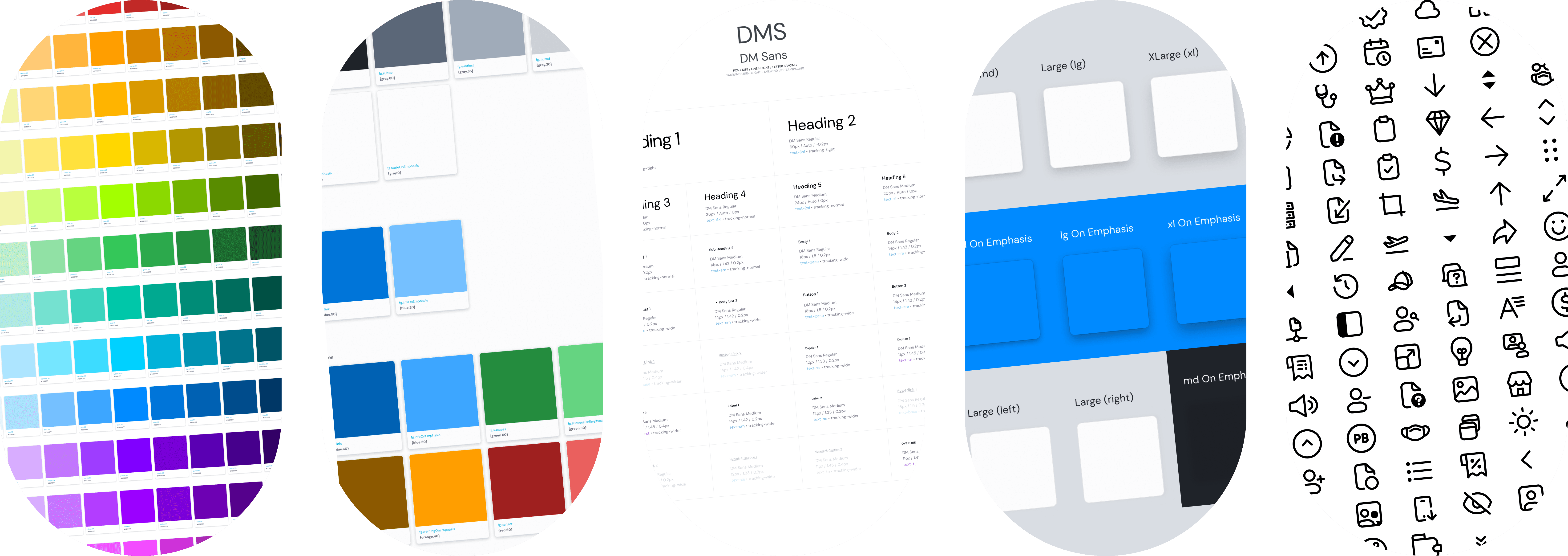
Primitives color palette
Semantics color
Typography
Shadows foundation
Iconography
A lot has been accomplished, including the most complex components. My work (translated into code by engineers, cheers! 🎉) can be seen here. The website is a testament to the collaboration of many parties, making it available online and serving as a single source of truth for other designers and engineers.
Conclusion
10+
Product teams
500k+
Insertions
350+
Icons
150+
Components
Looking back at my journey with Privy, what began as a personal solution to daily frustrations evolved into something much bigger. The Persona Design System (PDS) grew from a designer's need for efficiency into a fundamental transformation of how the company builds products. While I'm moving on to new challenges, I'm proud to have turned those late-night frustrations into a system that continues to serve as the foundation for Privy's digital future.
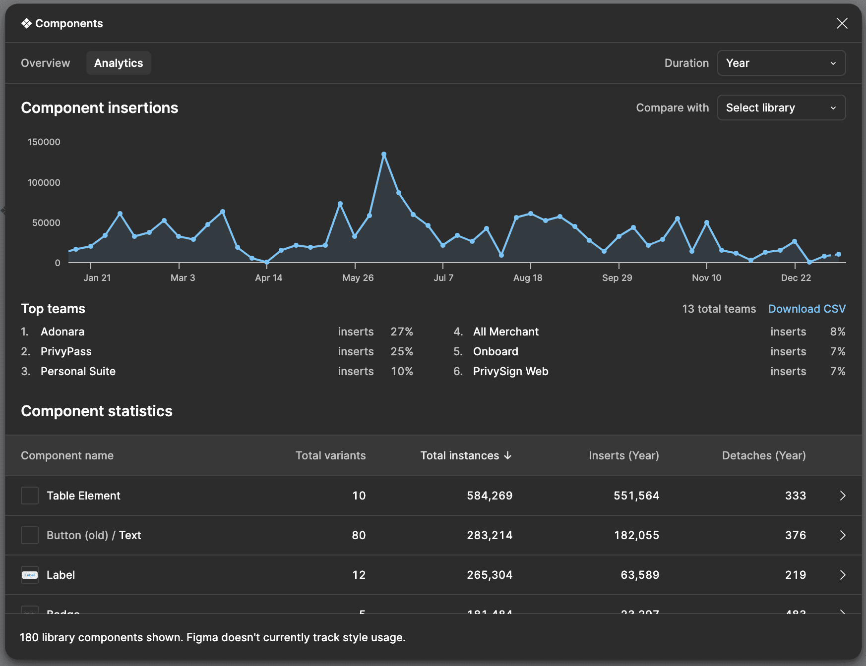
This is a screenshot of the analytics in Figma, and it only includes components. Colors, typography, icons, illustrations, etc., are in separate files.
Sometimes, the biggest innovations don't come from grand initiatives or executive mandates. They come from people in the trenches, experiencing problems firsthand, and quietly building solutions one component at a time.
© 2024 / rahen